
Touch Design – a combination of Industrial & Digital Design
Defining the right content that will respond to users’ needs is one of the core tasks of any content strategy. But thinking a little ahead, another issue arises - how to place that content on our screen and define an efficient and accessible layout!
Well, yes, you might think designing for touch is a topic for a UI designer, not a content strategist, but I wouldn’t agree. A content strategist should be aware of different screen sizes and the ways users approach them to define even better content.
Digital designers design for screens (we all know that) but nowadays they need also to customize their design to fingers and thumbs. When we design for touch, we slowly enter industrial design - the craft of shaping physical objects.
I would like to start this article by asking two questions:
- How do we hold our devices?
- Where do hands and fingers fall on the device?
Answers to these questions can help us to understand how to design layouts for comfort and efficiency. Since we hold different types of devices - phones, tablets, and laptops very differently, it’s no surprise that each of these touchscreen variations has its own UI needs.
In this article, I will focus on the devices I use most often and for which touch design is definitely, in my opinion, essential - smartphones and tablets.
How we hold a smartphone
Smartphone use is defined by 3 basic handholds, and we often shift among them.
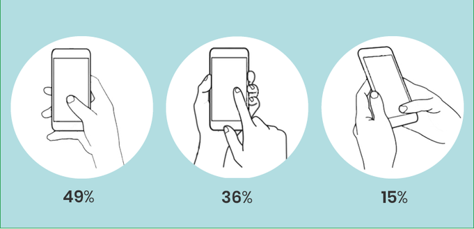
At 49%, the one-handed grip is most popular while 36% of users hold the phone in one hand and navigate with the finger or thumb of the other. The remaining 15% adopt the two-handed posture, tapping away with both thumbs.
What also happens often is what many of us know from our own phone habits that depending on convenience and context we change grips frequently. And what happens in most cases when we hold our phones with one hand, is that we usually use our thumb because it is the only finger comfortably available for tapping.
The phone’s thumb zone
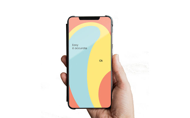
The blue thumb zone is the most comfortable and accurate area of phone screens for one-handed users. On the other hand, we should avoid putting the content of higher importance on the red-zone reach (Figure 2).
When we come to lefties the thumb zone fips from left to right. But this left versus-right distinction isn’t especially crucial, since most of us switch hands easily and frequently depending on context. While that happens often, optimizing for one hand penalizes the other. The best solution is to put core features at screen middle, where left and right thumb zones overlap.
In the end, we need to highlight that top versus bottom is more important than left versus right. No matter which hand we use, the screen bottom is most comfortable for reaching, while the top demands a stretch.
How we hold a tablet
Some research had shown that 88% of users interact with a tablet while sitting, compared to 19% of users who use the phone in a sitting position. As screens get bigger, they also get heavier, and we often lay them down on the table or some other surface. Each grip is also affected by how far away we hold the device - we tend, for example, to hold tablets closest while standing, and farthest while reclining. All of the above suggests we use large tablets more like traditional monitor screens.
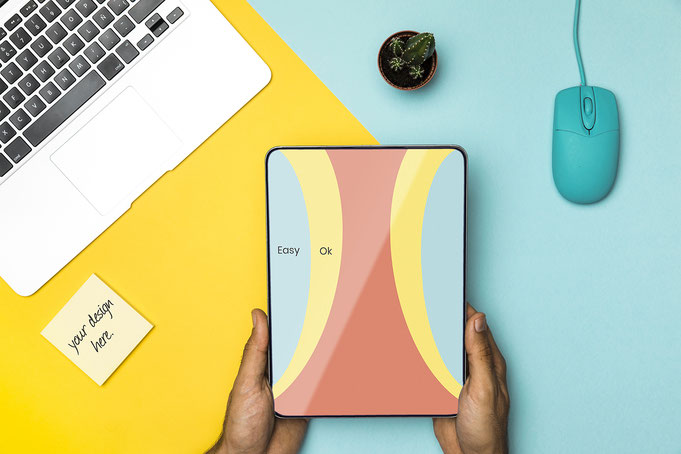
The Tablet’s thumb zone
The rule of thumb still applies, but with less consistency: the thumb zone isn’t consistent even for individual devices; it varies depending on stance and posture.
Usually when we lift up our tablets, they prove too big to be held and operated with one hand, so we have to employ both hands. Here again, thumbs play an all-important role. We tend to grab tablets at the sides, and our thumbs settle at the middle to top third of the screen. This grip makes the neighboring sides and top corners most friendly to touch (Figure 3). The top and bottom edges of tablet screens are hostile zones, because of the necessary reach. Because the tablet grip is typically at the side edges, the thumb zone changes completely from the phone’s.
Rules for designing layouts for handheld devices
The hand position—and, in particular, the thumb zone—tells us the most convenient locations to place controls and content. A few fundamentals can be applied to all types of devices:
- The rule of thumb
As the thumbs are primary pointers we should consolidate frequent controls into the thumb zones we identified earlier. Perhaps less obvious, it’s also crucial to consider what we place outside the thumb zone. Controls that alter data or could cause some harm should be removed from the easily accessible zone.
- Hands block the view
Beyond these issues of convenience and comfort, though, hands pose another physical consideration: we can’t see through them. Therefore, we should focus not only on the position of the hands when designing a new layout but also on our eyes. The position of hands while interacting with our device should not block our view of the screen.
- Content above controls
If we explore any machine from recent centuries, we will notice a cardinal principle of industrial design: content always appears on top. Whether that content is a calculator display or a paper in a typewriter, it must appear above hand-operated controls. This will prevent our fingers from covering important things.
Source: Clarck, J. (2015). Designing for Touch. A Book Apart.
Write a comment