
The stony path to intrinsic web design
My learnings of a speech by Jen Simmons
There has been a long and complicated timeline of different attempts to do page layout and graphic design on the web. This struggle results from the ongoing conflict between the desire for great layout versus the need of clear code. Designers figured out step by step that they cannot pretend the web is print. Instead of trying to implement techniques from print into web layout, they must go with the web, follow its rules, design with and in it. With the introduction of CSS a web-design-star was born.
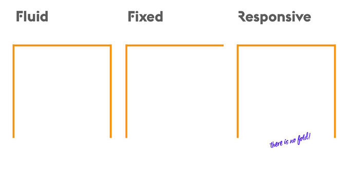
In her talk at the Event Apart Summit in 2018, Jen Simmons explains how web design developed in the last 25 years. In the first half of her speech she describes the history of web design in different stages: from pure HTML over the use of HTML tables to designing in flash, through fluid and fixed layout to responsive design.
We learn that there was this ongoing struggle between coding in high quality and the desire for a beautiful layout. Designers had to decide either to honour the code or the layout. They tried out different techniques to create web layouts. But none of these succeeded to integrate code and layout. And, images with their fixed sizes, always set constraints to these techniques.
CSS – the design star
With the upcoming of CSS, layout could finally be coded. This was a breakpoint. Now content and interface (HTML) could be separated from the visual tool and the layout in different layers of code. Later with Java Script a third layer could be added. But there were still constraints, because for the sake of good code, designers were supposed to stick to ideas which were feasible to code in CSS. It was important to have clear high-quality code, so that it can be reused; and to be able to create accessible, findable and searchable websites.
But the struggle with the fixed-seize images was not yet over. Text could float around a picture. But with limited space the picture would overflow. With a big screen a lot of white space would ruin the layout.
Responsive Web Design
In 2010 Ethan Marcotte coined the term of Responsive Web Design. He defined it as flexible grid, flexible images and media
queries. Now images became fluid. Depending on the viewport (the seize of the browser window) the image would be displayed bigger or smaller. This was made possible by media queries. The browser would choose the right seize of the image for the used viewport. So, the times in which one had to work around an image
passed.

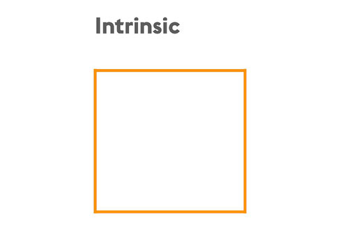
A new area – Intrinsic Web Design
In the second half of her speech, Jen Simmons argued that we just dived into a new area of web design at the beginning of the 2020s: Intrinsic Web Design. For her, another threshold. Now, the dynamic of the two competing directions - code versus graphic design - has changed completely. The term has its roots in the CSS intrinsic and extrinsic seizing module. “This module extends the CSS sizing properties with keywords that represent content-based "intrinsic" sizes and context-based "extrinsic" sizes, allowing CSS to more easily describe boxes that fit their content or fit into a particular layout context.”
The essence of intrinsic web design is that the code is no longer descriptive, but the designer/developer is programming a flexibility model. It is a model of artificial intelligence around how s(he) wants the browser to calculate the layout. In this way, the layout becomes flexible to all the different circumstances under which it is displayed and viewed (different kinds of browsers; behaviour of the user, e.g. reading mode; conditions like low internet connection).
Intrinsic Web Design brings:
- Mixed ways to expand and contract space
- New options for flexibility with images, columns and even rows
- Changes in how we use the viewport
Another huge gain of the combination of different CSS properties like Flex Box, CSS Grid, Multicolumn and Flow is the combination of horizontal and vertical resizing. The fold can finally play a role in web design.
The ways of combining all the new and old options to very flexible and creative layouts is a milestone in web design. Finally, art and code can shake hands and inspire each other.
This speech was a very hard one for me. I never got close to web design until my Studies of Content Strategy at the FH Joanneum, Graz. In my Accessibility and Responsive Web Design Course, I
learned all that technical stuff which was overwhelming for me as a non-digital native. The speech made responsive web design much clearer to me (after watching it three times). One big learning
was: if you want to do Web Design, you must learn to code. Otherwise, you will leave the field to the frontend developer.