
The most important visual design principles
Recently, while working on some projects, I was interested in learning more about the "principles of design" in visual design. Some visual designers will state that you need to own an innate sense for visual expression or in other words a “special gift”.
I guess that might be true because if someone is more a visual type of person, it will be easier to deal with visually oriented content. But I would also consider the possibility that visual design is not just about feeling (because we’re not talking about art here) and that there are some principles that need to be considered and mastered.
Exploring opinions on "design principles", I realized that there is no real consensus in the design community about what the main principles of design actually are. So, based on my experience and review of some articles and books on the subject, the following ten principles are most often mentioned:
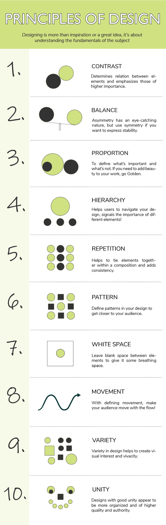
1. CONTRAST
Contrast refers to how different elements are in a design, particularly adjacent elements. These differences make various elements stand out. Contrast is also a very important aspect of creating accessible designs. Insufficient contrast can make text content in particular very difficult to read, especially for people with visual impairments.
2. BALANCE
Every element of a design— typography, shapes, patterns, colors, etc.—carries a visual weight. Some elements are heavier and draw the eye, while other elements may be lighter. The way these elements are laid out on a page and interact with each other should create a feeling of balance.
There are two basic types of balance: symmetrical and asymmetrical. Symmetry is a perfect balance, while asymmetry creates tension.
3. PROPORTION
Proportion is maybe one of the easier design principles to understand. It is about the relationship and size of one object to another. Proportion often signals what is important in a design and what is not. For example, larger elements may be more important and smaller elements less.
If proportions are based on the Golden Ratio (Divine Proportion) a mathematically developed formula, observed often in nature and applied to architecture and art we can ensure harmony and comfort of the visual experience. The Golden Ratio can help to create natural-looking compositions in our design work.
4. HIERARCHY
The hierarchical scale is mostly used in fine arts but is often used in design as well. Hierarchy is a principle of design that directly relates to how well content can be processed by people using a website.
Hierarchy is most easily illustrated through the use of titles and headings in a design. The title of a page should be given the most importance, and therefore should be immediately recognizable as the most important element on a page. Headings and subheadings should be formatted in a way that shows their importance in relation to each other as well as in relation to the title and body copy.
5. REPETITION
Repetition is a great way to reinforce an idea. It’s also an excellent way to unify a design that brings together a lot of different elements. Repetition can be done in a number of ways - by repeating the same colors, typefaces, textures, shapes, or other elements of a design.
6. PATTERN
Pattern is repeated use of an element or a group of elements (motif) in a recurring and predictable arrangement called a sequence. Wallpaper patterns are the most common example of patterns that virtually everyone is familiar with.
In design patterns can refer to set standards for how certain elements are designed. Top navigation is, for instance, a design pattern that the majority of internet users have interacted with.
7. WHITE SPACE
White space is also referred to as “negative space”— is the areas of a design that do not include any design elements. Many beginning designers feel the need to fill every pixel of the screen with a type of “design” and overlook the value of white space. Such behavior is not so unusual and new. In medieval art, it was called Horror Vacui which meant fear of the empty.
White space serves many important purposes in a design, for instance, it gives elements of the design room to breathe. Negative space can also help highlight specific content or specific parts of a design.
8. MOVEMENT
Movement refers to the way the eye moves over a design. The most important element should lead to the next most important and so on. This can be done through positioning (the eye naturally falls on certain areas of a design first), emphasis, and other design elements already mentioned.
9. VARIETY
Variety in design is used to create visual interest. Without variety, a design can very quickly become monotonous, causing the user to lose interest. Variety can be created in a variety of ways, through color, typography, images, shapes, and virtually any other design element.
Variety should reinforce the other elements of a design and be used to create a more interesting and aesthetically pleasing outcome that improves the user’s experience.
10. UNITY
Unity is the harmony of all visual elements in a composition. No single element takes over. Unity refers to how well the elements of a design work together. Visual elements should have clear relationships with each other in a design. Unity also helps ensure concepts are being communicated in a clear, cohesive fashion.
Design principles can definitely help us to keep important values in the design process. When successfully put together and used, design principles ensure consistency in decision-making among designers and teams, removing the need to discuss simple trade-offs and allowing designers to worry about complex problems.
In this article, I have listed design principles that I found to be very useful for my work, but I am sure there are more of them. If I missed mentioning some of them, let me know and we can discuss!
Write a comment